
In the last couple of years we’ve often heard about hardware acceleration and how it helps to improve animation on web pages, making them nice and smooth even on mobile browsers. But I think a lot of less experienced developers don’t know how hardware acceleration works and how we can use it properly to make our animations shine.
The term itself sounds like something overly complicated, close to higher mathematics. In this article, I’ll shed some light on this subject and demonstrate how to utilize this technique in your front-end projects.
Why Should I Care?
Let’s look at a simple animation example containing several balls stacked on top of one another (that is, on the z-axis, so it looks like one ball). The goal is to move this group of balls with animation. The easiest way to do this is to adjust the left and top properties. We could do this with JavaScript, but we’ll use CSS animations instead. Please note that I’m excluding any vendor prefixes but you should use something like Autoprefixer to ensure full compatibility.
[code language=”css”]
.ball-running {
animation: run-around 4s infinite;
}
@keyframes run-around {
0%: {
top: 0;
left: 0;
}
25% {
top: 0;
left: 200px;
}
50% {
top: 200px;
left: 200px;
}
75% {
top: 200px;
left: 0;
}
}
[/code]
Here is a live demo that uses a button to initiate the animation with JavaScript:
See the Pen Animating overlapping balls with top/left Properties by SitePoint (@SitePoint) on CodePen.
After clicking the “Start Animation” button, you’ll notice that the animation doesn’t look very smooth, even on a desktop browser. If you test the animation on your mobile device, you’ll see that it’s far from 60fps. To fix this, we can use CSS transform using the translate() function, instead of animating the top and left values.
[code language=”css”]
.ball-running {
animation: run-around 4s infinite;
}
@keyframes run-around {
0%: {
transform: translate(0, 0);
}
25% {
transform: translate(200px, 0);
}
50% {
transform: translate(200px, 200px);
}
75% {
transform: translate(0, 200px);
}
}
[/code]
Try the above code in the demo below:
See the Pen Animating overlapping balls with CSS transforms by SitePoint (@SitePoint) on CodePen.
Now the animation is nice and smooth. Great! So why did this help? Well, CSS transforms don’t cause repaints, unlike animations with the left and top properties. Let’s look at the Timeline panel in Chrome’s DevTools during the animation execution:
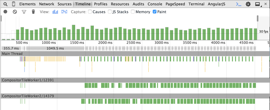
In the left and top example, we can see green bars at each animation step. This is an expensive repainting operation. The animation frame rate is less than 60fps, which we always aim at achieving to make the animation smooth.
Now look at the timeline in the case of CSS transforms:
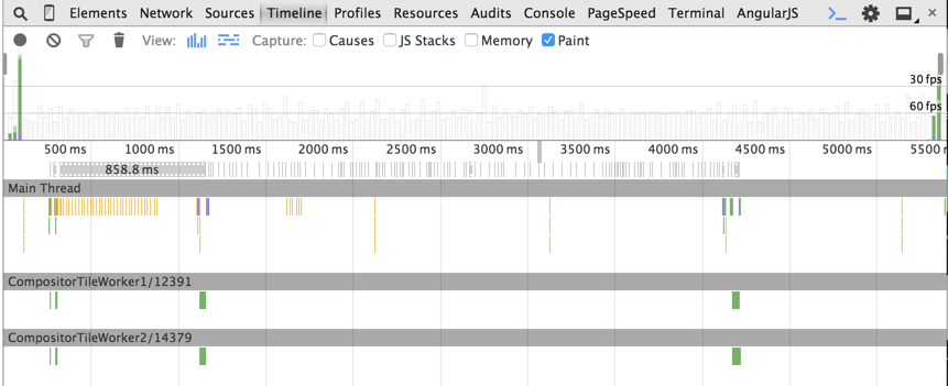
As you can see, there are no green bars during the animation.
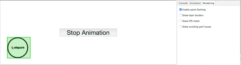
Another feature available in Chrome’s DevTools to track the repainting process is “Enable paint flashing”. You can find this option by opening the DevTools, hitting the ESC key, then choosing the “Rendering” tab. When this feature is turned on, green boxes (i.e. paint rectangles) will appear around repainted areas. In the left and top example, the balls have a green box for the entire animation process, indicating the repaints.
On the other hand, in the CSS transforms example, the paint rectangle is displayed only on the first and last animation frames.
So how exactly do transforms render the animation without repaints? The basic answer is that CSS transforms occur directly in the GPU memory that utilizes hardware acceleration, which avoids software rendering. Let’s look at this in more detail.
How Hardware Acceleration Works
When the browser receives a page’s markup, it parses it to build the DOM Tree. The DOM Tree and CSS allow the browser to build the Render Tree. The Render Tree consists of render objects – the elements to be rendered on the page. Each render object is assigned to a graphic layer. Each layer is uploaded to GPU as a texture. The trick here is that the layer may be transformed in the GPU without repainting, like in the case of 3D graphics. These transformations are made by the separate Compositor process. You can find more information about the composition in Chrome here.
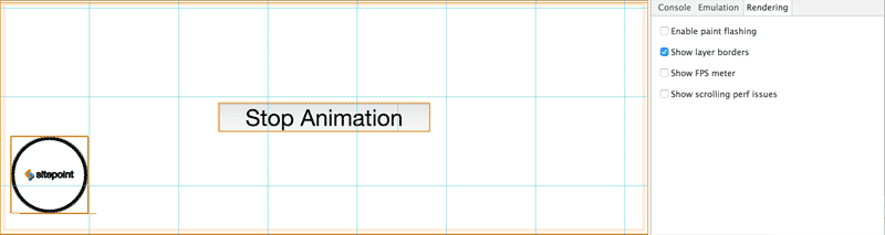
In our example, the CSS transform creates a new composite layer that can be transformed directly in the GPU. Chrome’s DevTools allow for viewing composite layers using the “Show layer borders” option. Each composite layer has an orange border.
Our balls with the CSS transformation have orange borders and are moved to separate composite layers:
At this point, you might ask: When does a browser create a separate composite layer?
Continue reading %An Introduction to Hardware Acceleration with CSS Animations%
Source: SitePoint