
Not too long ago, adding decorative elements like fancy borders to a web page involved slicing images and patiently tweaking away at the CSS until it looked just right.
CSS has changed all this. A few lines of code are all you need to decorate your website with quite sophisticated borders. This article will show you how you can do so.
Border Image Properties
A common way of styling borders is by using preset border-style rules. These are: dotted, dashed, solid, double, groove, ridge, inset, and outset.
These styles already give you quite a bit of choice. But you can go a step further and add appealing background images to your borders with the following CSS properties.
The border-image-source Property
With this property you assign a background image to an element’s border. The value is usually the image’s URL:
[code language=”css”]
element {
border-image-source: url(‘myimage.png’);
}
[/code]
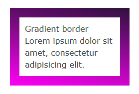
You’ll find that a CSS gradient works just as well:
[code language=”css”]
element {
border-image-source: linear-gradient(10deg, #fe01f5 0%, #2e113d 100%);
}
[/code]
In the browser it looks something like this:
If you set this property to the value none, or the image can’t be displayed, the browser will use the values set for the border-style property. Therefore, it’s a good idea to use border-style as a fallback.
The image you use doesn’t need to match the width and height of your border. The beauty of CSS border images is that a small image is all you need to decorate an element’s border of any width and height, including elements that responsively adapt to varying screen sizes.
The border-image-slice Property
After you select an image using the border-image-source property, you apply it to the border using the border-image-slice property.
[code language=”css”]
element {
border-image-slice: 19;
}
[/code]
Let’s get into a bit more details. This property designs inner offsets from the top, right, bottom, and left sides. The offsets end up slicing your small image into nine areas: four corners, four edges and a middle.
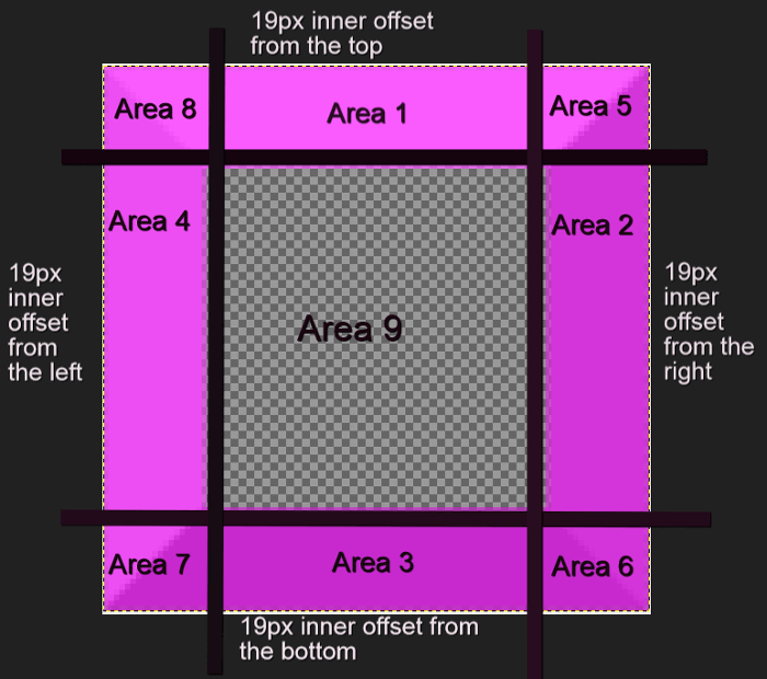
You can specify one to four numbers or percentage values. When you specify four values, they apply to the top, right, bottom and left offsets. If you skip the left offset, this will be the same as the right. If you miss the bottom offset, this will be the same as the top one. Omitting the value for the right offset will make this the same as the top. If you only use one value, it will be used for all four offsets.
Percentage values refer to percentages of the size of the image – the image width for horizontal offsets and the image height for vertical offsets.
Numbers stand for pixels in the image, or for coordinates in case of a vector image. One more thing, don’t add px after the number, it won’t work if you do!
Here’s how you can use border-image-slice:
[code language=”html”]
<div class="box">
Border Image
Lorem ipsum dolor sit amet, consectetur adipisicing elit.
</div>
[/code]
[code language=”css”]
.box {
border: 19px dotted #c905c6;
border-image-source: url(border-bg.png);
border-image-slice: 19;
}
[/code]
Using a 100 x 100px image for your border that looks like this:

We end up with something looking like this:
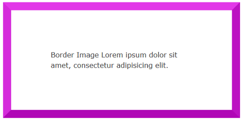
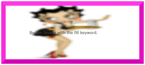
The middle region renders as fully transparent, therefore it’s not visible. If you’d like to make it visible, add the fill keyword.
For instance, using an image with a fully opaque middle area, without adding the fill keyword, will display exactly like the example above. However, apply the fill keyword like so:
[code language=”css”]
.box {
border: 19px dotted #c905c6;
border-image-source: url(border-fill.png);
border-image-slice: 19 fill;
}
[/code]
With an image with a middle area containing details:

We then will find the image’s middle area is fully visible on the page, albeit somewhat blurred and squashed:
The border-image-width Property
This property is drawn inside what’s called the border-image-area. By default, the boundaries of this area are those of the border box. Just like the border-image-slice property, the border-image-width designs inner offsets which divide the image into nine areas.
Continue reading %Decorating the Web with CSS Border Images%
Source: SitePoint