
This article is part of a web development series from Microsoft. Thank you for supporting the partners who make SitePoint possible.
What is a Hybrid Mobile App?
A hybrid mobile app is similar to any app that you download from an App Store, but the fundamentals of how they work is different from native apps.
Like websites, hybrid mobile apps are built using web technologies like HTML, CSS, and JavaScript, so most of the JS libraries developers use over the web can be reused for hybrid apps too. The key difference is that hybrid apps are hosted inside a native application that utilizes a mobile platform’s WebView. This enables them to use device capabilities like the accelerometer, camera, and many other system APIs. These capabilities are often not accessible by a website running on mobile. The web is also more interoperable than ever—including modern browser engines like Microsoft Edge’s EdgeHTML—so if you’ve previously ruled out hybrid solutions, it’s a good time to reconsider a hosted web app solution (more on that below).
Where Do Hybrid Mobile Apps Come From?
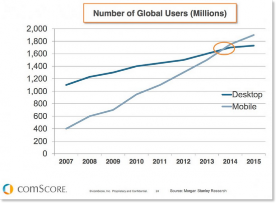
The above graph clearly communicates that the number of mobile users have clearly overtaken desktop users, which is resulting in businesses refocusing priorities to cater to mobile users. While businesses already had a presence on the web—in most cases a website—the easiest option for them to scale up to all mobile platforms is to consider the hybrid approach. It helps them to keep teams with similar skillsets without having to invest hugely in iOS, Android, or Windows Native developers in one go. It sounds like a cost effective strategy, so let’s dig deeper.
HTML5, CSS3 & ES6 in a Mobile App. Really?
In recent years the web has moved towards standards. We rarely find new web apps with metatags for compatibility with IE6. These HTML5, CSS3 and ES6 standards means the web is now cleaner, working across standard browsers without having to change code. In fact, you can scan your website for interoperability best practices here that also help development of cross-platform hybrid apps.
- Looking at this, we can leverage the standards to ensure we end up using the same DOM even in hybrid mobile apps across all platforms. This approach helps us write clean code and helps easily maintain it. Check out the code for the native-looking header bar for iOS, Android and Windows Phone on JSFiddle.
- With new HTML5 and CSS elements, we can take care of various screen resolutions that our hybrid apps will run on. In order to make your images look crisp for everyone, you usually have to deliver twice the dimensions than what is actually shown in your app. Serving properly sized images for all different resolutions is one of the most discussed topics in responsive web design. There are various approaches, each with its benefits and drawbacks related to bandwidth, code maintainability and browser support. Let’s quickly review the most popular ones:
- Image resizing from server-side
- Client-side detection and replacement via JavaScript
- HTML5 picture element
- HTML5 srcset attribute
- CSS image-set
- CSS media queries
- Resolution-independent images (SVG)
- CSS3 media query works out well for loading logos appropriately based on screen size the hybrid app gets rendered on:
/* Normal-resolution CSS */ .logo { width: 120px; background: url(logo.png) no-repeat 0 0; } /* HD and Retina CSS */ @media only screen and (-webkit-min-device-pixel-ratio: 1.25), only screen and ( min--moz-device-pixel-ratio: 1.25), only screen and ( -o-min-device-pixel-ratio: 1.25/1), only screen and ( min-device-pixel-ratio: 1.25), only screen and ( min-resolution: 200dpi), only screen and ( min-resolution: 1.25dppx) { .logo { background: url([email protected]) no-repeat 0 0; background-size: 120px; /* Equal to normal logo width */ } } - Similarly, we can use platform specific fonts by querying device type.
/* Windows Phone */ font-family: 'Segoe UI', Segoe, Tahoma, Geneva, sans-serif; /* Android */ font-family: 'RobotoRegular', 'Droid Sans', sans-serif; /* iOS */ font-family: 'Helvetica Neue', Helvetica, Arial, sans-serif; - Single-page application (SPA) is a web application that fits on a single web page with the goal of providing a more fluid user experience akin to a desktop application. There are libraries which help web developers make more fluid web experiences:
- AngularJS
- EmberJS
- BackboneJS, etc.
Continue reading %A Simple Case for Hybrid Mobile App Development%
Source: SitePoint