Google the term "UX best practices" right now and you’ll get an endless stream of search results, the majority of which will be focused on tactical activities: UI design trends, how-to design articles, software tools and tutorials, a rehash of basic principles for UX or design or development.
These are all valuable, mind you, but they’re only a small part of what it takes to deliver a successful product–one that provides value to users and, therefore, value back to the business. One that helps people do things quicker, easier, faster, more accurately or more efficiently, in addition to looking good and not causing eye strain.
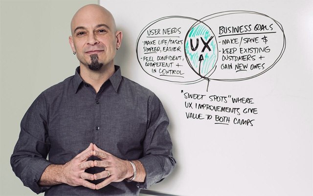
Great UX isn’t a product of the tools you use, and it isn’t what you build or design on screen. It’s how you think about those things.
Great UX isn’t a product of the tactical work you do; it’s a product of how you decide what tactical work to do. It’s not the decisions you make; it’s how long and hard you think about and arrive at those decisions. It’s not about how content, data or controls look on the screen; it’s about whether those things belong there in the first place.

How UX Design Typically Happens (And Why It’s Wrong)
I spend a great deal of time working with design and development teams in enterprise organizations and mid-size companies, and there are some commonalities in the way they begin the process of UX, design, and development.
And before you read this next bit, I want you to understand that I’m not picking on anyone; I absolutely understand why it happens.
Here’s what I see a great deal of:
- Starting with themes. For example, if the team’s building with Bootstrap, the first thing that happens is they choose a pre-built Bootstrap theme and run with it. The chosen theme essentially becomes the foundation of the project’s UI and UX design, and it stays that way through launch. The pre-built theme probably looks nice, but it was created in a vacuum. The theme doesn’t take into consideration the project’s unique design and development challenges.
- Starting with the work of other designers or developers. One of the most daunting things in life is a blank page, or a blank screen. Starting is the hardest part. So we hit up Pinterest, Behance, Dribbble, etc. to look at the freshest, newest, hippest UIs. But if you’re a designer or developer — experienced or fresh out of school — I want you to understand that you will not find the answer looking at the work of others. What you will find is someone else’s solution to someone else’s problem. The problem you have to solve belongs exclusively to you, to your client, and to your users. Mimicking someone else’s work won’t solve it.
- Starting with current UI trends. Flat design, anyone? Flat design has obviously become a widespread trend. And while it’s appropriate in some instances, it’s being applied haphazardly to all manner of interactions. Designers are adopting the look without taking the time to think about whether it’s appropriate for the situation or whether people will understand what they see. And a great deal of flat design I see is applied without visual affordances, which makes it difficult for the user to understand that what they’re seeing is interactive. That it can be tapped or swiped or clicked to make something happen. Visual affordances clearly communicate purpose and function,and you cannot remove them and expect people to know what to do.
Why Does This Happen?
There are some very good reasons people take these approaches. In most cases, these courses of action with regards to UX design are symptoms of one or more of these scenarios:
- The team is short-handed and out of time. They’re working within a ridiculously compressed timeframe that doesn’t allow for any exploration or investigation into what’s most appropriate or even what the real strategic objectives are. The only objective is just to get the project completed.
- Other departments or management personnel are making the UX and design decisions. Someone is saying "make it look like Amazon," or whatever site, app or system they’re enamored with or believe to be best practice. Or they’re saying "we need to move to flat design like everyone else." The point is, they’re mandating solutions, usually before the team even understands what the problems are.
- The team is being asked to do things they don’t have a lot of experience with. If I had a nickel for every time a team of developers were tasked with the additional mountainous job of designing the UI and making sure the UX was great, I’d be retired and living on a desert island with little umbrellas in my drinks. Here’s the thing: UX is not UI is not Development is not Programming is not… you get the idea. It’s more than a little unfair to ask someone to do something they have no experience in or training for. But that’s exactly what happens; it’s a lot like asking your plumber to fix your car.
The Answer? Think First. Design Next.

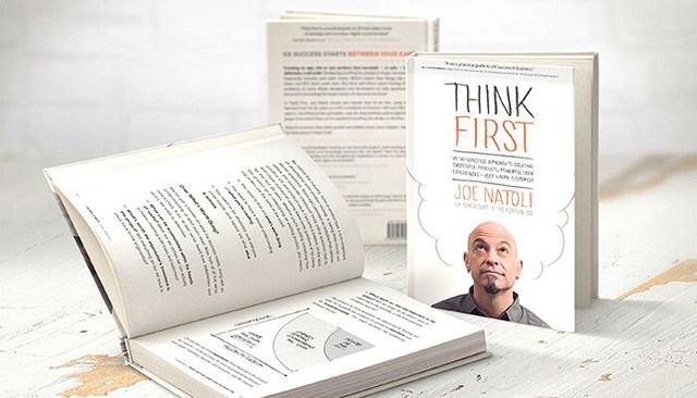
The title of my new book, Think First, reflects my firm belief that strategic thinking is the foundation of great UX. Think First was created on the idea that a little strategic thinking goes a very long way. And that if you think first, you’ll find that the foundations of good UX will be evident in all you do. It’s the most critical part of everything we do as UXers, designers, developers, business analysts, product owners, and so forth. Because if you skip that part, or if you guess at what matters most, you’re likely designing and building something that people either don’t want or can’t use.
So the answer to the problems we’re discussing here is this: Think first. Design next.
Everyone, every member of any team, can and should contribute to great UX.
How? By changing the way they think about what they do during the day. By making sure everyone understands the strategy behind what’s being built. By getting everyone on the team in the habit of questioning what they’re about to do, of asking themselves questions like:
- Does the potential reward to users or to the business equal the time and effort we’re going to spend doing this?
- Does this feature or function really matter to people? Is it in line with what we believe they’ll find useful, usable or valuable?
- How do they expect this feature/function to work? Does this workflow run counter to what they’re used to?
- Will our users understand what this label means?
- Is what’s on this screen in line with what we know users need to see or do first? Is this data point we’re showing on an already crowded screen critical in enabling the user to understand or act, or is it just noise?
The answers build the foundation of the user experience. And when everyone filters their decisions and activities through that foundation, those daily decisions and activities change. For the better. And when you can’t do anything about unreasonable time and budget constraints, you’ll at least make better use of the time over the target you do have. You’ll be focusing on the important instead of the urgent.
Related Content
- UX Design Tips for Your App
- A Quick Introduction to Agile UX Design
- How Fonts Affect the User Experience
The post Why Great UX Starts Between Your Ears (Not on the Screen) appeared first on Six Revisions.
Source: Six Revisions

