
UX design certainly isn’t easy, but the high expectations of clients and stakeholders might suggest otherwise. The decision-makers don’t always understand the design process, and they look to the designer as the all-knowing, all-fixing genius.
But no pressure.
From my conversations with the design team at UXPin, we’ve noticed a few common pitfalls that every designer should avoid vigilantly.
Let’s explore each mistake and solutions to keep you sharp.
Mistake #1: Designing for Yourself
When you work in a creative field, you tend to form strong opinions and view your worI'm k through a lens of your personal preferences. But the important thing to remember is that you are just one type of user.
A designer is never the target user all the time.
Effective UX designers separate personal preferences from their design. They understand they’re designing for users that think and behave differently than they do – and a UX designer’s skill can be measured in how well they can empathize with personalities other than their own.
Of course, it’s not always easy to distance your wants from the needs of the user. Designers feel an almost parental sense of responsibility for their creations, favoring design choices that benefit their goals, not the product’s goals.
But your responsibility is to the users (and stakeholders), not your ego.
Let’s take a look at the design choices of the BBQ Cultures site by Weber Grills. Every UX decision is dedicated to a very specific target user: a middle-aged person (likely male) who enjoys the outdoors.
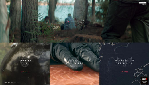

The bold rich colors, high definition images, and crisp intro video – paired with a masculine voiceover – all appeal to outdoorsmen and weekend warriors. The site even mimics the excitement of snapping open with an interactive slider. The mad-libs style form also appeals to the user’s ego – not the designer’s.
If you’re still having trouble removing the "U" from UX, follow these quick tips, straight from Web UI Best Practices:
- Personas are your best imaginary friends. Creating a user persona lets you substitute the correct target user in place of yourself. Built on real user data and given a fabricated personality, personas help designers envision how actual people will use the site. At every major design decision, ask yourself what your persona would want, not what you want.
- User journeys can further map out how personas will likely interact with your site.
- Identify the most difficult aspects of the UI and then wireframe those parts according to user journeys.
- Conduct usability tests to better understand what your users want and to create more reliable personas. For example, A/B testing determines user preferences for colors, buttons, text, images, etc. If the project is big enough, conduct some field research with users.
Useful Resources
Mistake #2: Confusing UX and UI
Mixing up UX and UI is a common, even understandable, mistake, but it can still be disastrous to your design. The confusion arises because they’re interrelated, but when you look closely they’re two completely different disciplines.
The user experience (UX) is just that: the emotions the user experiences when using the product. The satisfaction a user feels when quickly and effortlessly completing an action is UX. The user interface (UI) is the system itself, the elements the user interacts with. The buttons and clicks used to complete the order are UI.
The UI helps create the UX.
An analogy to painting helps: the UI is the paint, the colors, and the brush strokes; the UX is the feeling the viewer gets when seeing the girl with the pearl earring.
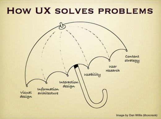
Like the graphic above shows, UX requires mastery of many different disciplines. That’s why a product can have a great UI but a poor UX, whereas a good UX needs a good UI.
As mentioned above, usability testing keeps you on track. Asking the right questions – about how the user feels – places focus on the overall experience instead of the technical points.
Don’t be guilty of the Dribbblisation of Design.
When it comes to UX or UI design, start with the content first. After some initial user research, create an interactive site map that actually clicks through to your pages. Whether you’re using Keynote or a digital prototyping tool like ours, always start with a site map so you can gauge the overall flow of the experience.
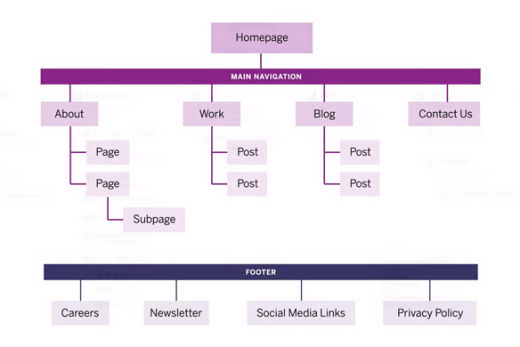
As you can see above from design agency Barrel NY, site maps document the information architecture for your site. Once you’ve created this page, make sure you allow each "branch" to then click through to the wireframe or prototype of the page itself.
When we were redesigning our own UXPin prototyping tool, we prioritized the work accordingly:
- Content structure
- Interaction design
- Visual design
Content is what users actually care about, so this process puts the UX first and lets the UI adapt.
Useful Resources
- Designing Content First for Better UX
- It’s Not UI vs UX, It’s UI and UX
- Free ebook: Web UI Design Best Practices
Mistake #3: Making the User Think
Speaking scientifically with the backing of previous studies, people are just plain lazy.
As Steve Krug famously pointed out in Don’t Make Me Think, users want to think as little as possible, and it's the duty of the designer to cater to their laziness.A successful UX minimizes friction.
Like Interaction Design Best Practices recommends, you want to remove any unnecessary steps, clicks, and inputs.
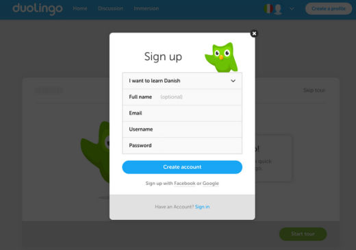
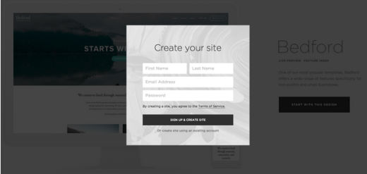
Duolingo, for example, only asks for the necessary data needed to state an account, and nothing more. Entering age or gender, while helpful to the designer, is just another step that the user doesn’t want to take.
This isn’t just speculation, either: a study carried out on Imaginary Landscapes proved that too many form fields actually discourages signups. It’s a big UX mistake that directly hurts your conversion rate. Expedia provides more evidence – by removing a single field (company name) from their form, they increased sales to the tune of $12m.
Yet again, the solution lies in user testing. You can determine your target users’ threshold of thought quantitatively, revealing the perfect number of pages, clicks, and fields in a form. These numbers will vary depending on your product and the type of users – there is no magic number, so tests like A/B testing are the most reliable methods.
Just keep in mind that there are other aspects to consider besides your users’ preferences. Sales teams will want more lead information, or external ad demands might cause friction. The only way to strike a balance is to test.
Useful Resources
- A Shorthand for Designing User Flows
- How to Reduce Friction With Good Design
- Free ebook: UX Design Process Best Practices
Continue reading %3 UX Mistakes That Are Killing Your Design%
Source: SitePoint