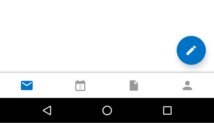
When it comes time to design an interface, there is a serious question to ask—are you a top or a bottom? Me, I’m a bottom. I find buttons much easier to access when they’re at the bottom of the screen. Reaching towards the top, to me, is simply awkward.
In the latest version of Outlook, the developers must feel the same. They’ve taken the quick access buttons that used to reside in the top of the side navigation menu and moved them down below.
Outlook Developers Decide Maybe It’s Nice To Have Quick Access Buttons At The Bottom, Like Gmail Used To was written by the awesome team at Android Police.
![]()
Source: Andriod Police

