
Remember 2015? The Apple Watch, the new iPhone 6S, falling in love with Jurassic Park again. It seems like only yesterday.
2015 left its unique style on everything, including web design, which continues adapting this year to mobile browsing overtaking desktop. Based on my own discussions with the design team at UXPin, let's explore the top ten trends and how to continue reaping their benefits going forward into 2016.
1. Minimalism
Minimalist sites embody one of the central ideals of web design in 2015: simplicity. Stripping away all but the essential elements does more than give your site an air of elegance – it also reduces loading times, a nice advantage for mobile browsing. Plus fewer elements means easier responsive design.
As explained in the free guide Web Design Trends 2015 & 2016, the minimalist aesthetic also worked together with advancement in visual capabilities, which encourages other trends like HD backgrounds.
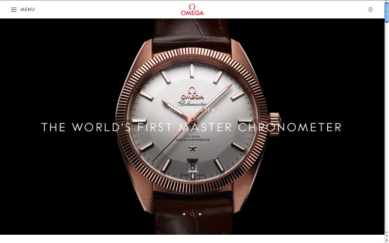
In the example above, OMEGA includes only what's necessary: language settings, expandable menu, and the logo for returning to the home page. This draws attention almost exclusively to the hero image of the luxury product because there's not many other UI elements to compete with.
Tips
Save space with slideouts or pulldown menus.
Applying different degrees of symmetry keeps the site from looking dull, especially asymmetry.
Free Resources
Gallery of Minimal One-Page Websites – A site dedicated to featuring the best one-page websites.
Best Minimalist WordPress Themes – A nice launchpad for minimalist templates, though not all are free.
Design Trends: Elegance of Minimalism – A free guide teaching useful web minimalism techniques based on 28 examples of the year's best designs.
2. Long Scrolling
Smaller screens means longer scrolls.
With the "below the fold" myth proven wrong, today designers and users alike are recognizing the value of long scrolling: more creative freedom, improved storytelling, stronger interactions, and simplified navigation (if the site is small enough).
Long scrolling works best for sites with heavy mobile traffic or frequently updating content, and is less effective for sites with heavy media like videos, which drag on loading times.
Tips
Sticky navigation menus or jump-to-section options protect against disorienting users, which is a common concern with scrolling.
Draw out the playful aspects of long scrolling with effects such as parallax and scrolling-triggered animations.
Avoid the negative SEO effects by following the advice in this Moz article and this Quicksprout article.
Free Resources
One Page Love – A gallery of the best single-page websites, updated regularly.
"Apple Resurrects the Scroll Wheel" – A TechCrunch article analyzing how the Apple Watch may breath new life into scrolling websites.
How to Create a Parallax Website – A two-part tutorial that teaches the fundamentals, including coding, for parallax design.
3. The New Flat Design
Today's flat design has evolved from its roots as an alternative to skeuomorphism. The new, more nuanced iteration of flat design – Ryan Allen calls it "Flat Design 2.0" – offers more opportunity for details and flourishes:
-Lighting glares and highlights -Gradient and/or drop shadows -Greater values for detailing
Like minimalism, flat's simplicity remains its strength. The almost cartoonish graphics, legibility-first typography, and playful colors keep the style geared for easy comprehension.
Tips
Ghost buttons can be used outside of flat design. Their transparency keeps focus on background image, making them a popular addition to hero images.
Flat's simple graphics make loading a breeze. This works perfectly for responsive design.
Free Resources
Design Trends: Evolution of Flat Design – A free guide teaching flat techniques based on 18 examples of the year's best designs.
25 Flat Device Mockups: Templates for creating flat design mockups on a variety of devices.
50 Flat Icon Sets: Digital Synopsis's roundup of 50 flat icon sets that are free to use or peruse.
4. Powerful Animations
Because motion attracts attention, animation can influence the visual hierarchy of what gets seen first. Moreover, animation also show relations: imagine an animation of a window shrinking and flying into the menu – this animation confirms the action's success, and also shows the user where on the menu they can view the window later.
The fly-in menu, as prototyped below in UXPin with the no-code animations editor, demonstrates this principle perfectly.

At the very least, animation gives life to dull actions. A hover animation shows a link is clickable more than a simple color change.
Tips
Web and app animations can still make use of Disney's classic 12 rules of animation.
Long scrolling formats rely heavily on animation to create the appearance of smooth scrolling. On top of that, animations triggered by scrolling create a more immersive and entertaining site.
Loading screen animations give users an estimation on time and entertain them while waiting.
Subtle animations in the background, as long as they're not excessive or distracting, can add a little energy to an otherwise stale visual.
Free Resources
CSS3 Animation Cheat Sheet – This useful collection of ready-made, plug-and-play animations lets you apply premade CSS classes to any element you wish.
Web Animation – A frequently updated guide to synchronization and timing for animation in web pages and APIs.
Interaction Design & Animations – Free 80-page guide teaching interaction design techniques based on 47 examples of the year's best designs.
Continue reading %The 10 Big Web Design Trends of 2015%
Source: SitePoint