
There’s no way to design without color – even a strictly black-and-white site has multiple options for hue, contrast, and balance.
With the lingering presence of flat design (now flat 2.0), color holds even more prominence in web design today. Rainbows of bright colors span the Internet, attuned for the both the playfully cartoonish style popular today, and also for the elegantly minimalist style, which must make use of color as one of its few visual elements.
Now and in the near future, we will see a lot of these brighter, happier tones, making vibrant colors one of the biggest web design trends of 2015 and 2016.
Links in Fashion and Interior Design
As explained in Web Design Trends 2015 & 2016, bright colors aren’t just a trend on the web.
They seem to be universal across all industries, especially fashion and interior design, two visually dominant areas that have more than a little in common with web design.
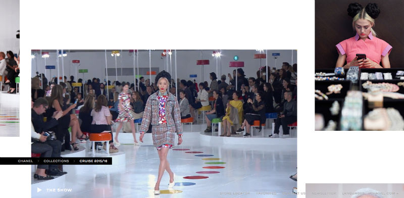
Photo credit: http://www.chanel.com
The takeaway is that, by keeping tabs on what’s happening in these industries, you’ll have a better understanding of what’s going on in web design. The same colors people want to wear on themselves or see in their homes are the same colors that they’ll enjoy when browsing the web.
After all, the end result of using color is the same across all industries: connecting with the user. Color has the ability to create a sturdy emotional link with people, whether on a handbag or a home page.
Why Now?
The appeal of the vibrant color trend is that it can be applied in many different ways and styles to many different elements. With their diversity and versatility, today’s bright color patterns are burying the "template" look of the plug-and-play site themes that had been popular before.
In the below prototype created in UXPin with the no-code animations editor, notice how bright colors improve visual communication. By selecting different shades of the same orange for the navigation, the UI instantly expresses that all items are related to each other.

What started as a trend for only creative sites like artist portfolios and/or designers, today bright colors are being implemented in more mainstream and traditional industries like news and weather sites. It’s even seeping into e-commerce, an industry historically predominated by black-and-white.
Bright colors are losing their stigma of silliness and are started to be accepted as professional.
It’s no coincidence that vibrant colors are becoming popular today. In fact, we can link the trend’s popularity to two major developments: high definition and flat design.

Photo credit: http://cyclemon.com/
The more pixels per inch on high definition displays allows for more distinct colors. While in the past designers could use only 216 web safe colors, today’s technology allows millions, and over 98% of users have personal access to such technology (according to a W3Schools study).
As Retina and other high-definition displays were becoming more readily available, flat design was also growing in popularity. This was no coincidence either. Flat design, too, is a product of newer technological options, but it also resulted as a backlash against the skeuomorphism that dominated the web design scene prior.
Continue reading %Web Design Trends 2015 & 2016: Fearless Colors%
Source: SitePoint