
AKRABAT
As dark mode is more popular than ever now that the iPhone supports it, I’ve been working out how to get the browser to render a dark image in dark mode and a light image in light mode.
It turns out that the way to do this simply is to use the <picture> element like this:
<picture>
    <source
        srcset="/wp-content/uploads/2019/11/example-image-dark.png"
        media="(prefers-color-scheme: dark)"
    />
    <source
        srcset="/wp-content/uploads/2019/11/example-image-light.png"
        media="(prefers-color-scheme: light), (prefers-color-scheme: no-preference)"
    />
    <img src="/wp-content/uploads/2019/11/example-image-light.png"
         alt="Description of example image here"
         class="border" loading="lazy" />
</picture>
As I use MarsEdit to write my posts, I created a Media Markup Template that does the heavy lifting:
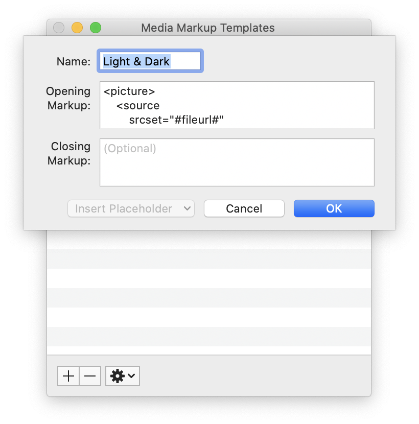
The template looks like this:
<picture>
    <source
        srcset="#fileurl#"
        media="(prefers-color-scheme: dark)"
    />
    <source
        srcset="#fileurl#"
        media="(prefers-color-scheme: light), (prefers-color-scheme: no-preference)"
    />
    <img src="#fileurl#" loading="lazy" alt="#alttext#" class="border" width="#imgwidth#"/>
</picture>
It’s essentially the same as above, but with MarsEdit’s placeholders. I manually remove the class="border" if I don’t want a border on this image.
I can now drag an image for light mode into the MarsEdit compose window and it fills does most of the work. I then upload the dark mode image, update the URL for the first <source> element and I’m done.
If I’ve done it right, the screenshot in this post will be light or dark depending on the mode that you’re viewing this page in. Next, I need to work out how to get my syntax highlighter to honour dark mode!
Source: AKRABAT